So, you’ve got some data and you’ve run a clustering algorithm. Now what? You need to actually see what’s going on, right? That’s where visualizing clusters with Python’s Matplotlib comes in. It’s not as scary as it sounds. We’ll walk through how to turn those numbers into something you can actually understand, making your data exploration way more effective. Let’s get those clusters looking good.
Key Takeaways
- Start by getting your Python setup ready and bringing in the libraries you’ll need for visualizing clusters with Python’s Matplotlib.
- Learn the basics of making scatter plots and how to color-code points based on their cluster assignments.
- Make your plots clearer by adding labels, titles, and perhaps changing marker styles or transparency.
- Explore different ways to show your clusters, like using various color schemes or making comparison plots.
- Consider advanced tricks such as adding interactivity or showing cluster boundaries to get more from your visualizations.
Getting Started With Visualizing Clusters with Python’s Matplotlib
Alright, let’s get this cluster visualization party started! Matplotlib is our go-to tool here, and it’s pretty straightforward to get going. We’re going to build up our skills step-by-step, so don’t worry if you’re new to this.
Setting Up Your Python Environment
First things first, you need Python installed. If you don’t have it, grab it from python.org. Then, you’ll want to set up a virtual environment. It’s like a clean sandbox for your project, keeping things tidy. You can do this with venv (built into Python) or conda if you’re using Anaconda.
Importing Essential Libraries
Once your environment is ready, we need our tools. The main players are:
- Matplotlib: This is our plotting library. We’ll import it as
plt. - NumPy: For numerical operations, especially if your data is in arrays. We’ll import it as
np. - Pandas: If your data is in a table format (like a CSV), Pandas is a lifesaver. We’ll import it as
pd. You can find some great resources on DataPrepWithPandas.com to get comfortable with it.
Understanding Your Data for Visualization
Before we can plot anything, we gotta know what we’re looking at. What do your data points represent? How many features (columns) do you have? What do the cluster labels mean?
Knowing your data’s structure and what each piece signifies is half the battle. It helps you choose the right way to show it off.
Think about:
- Features: What are the dimensions of your data? For visualization, we usually pick two or three to plot.
- Cluster Labels: These are the groups your data has been sorted into. We’ll use these to color-code our points.
- Data Types: Are your features numbers, categories, or something else? This affects how you might represent them.
Creating Your First Cluster Scatter Plot
Alright, let’s get down to business and make some actual cluster plots! We’ve got our data ready, and now it’s time to see those groups come to life. Matplotlib makes this surprisingly straightforward, so don’t worry if you’re new to plotting.
Basic Scatter Plotting Techniques
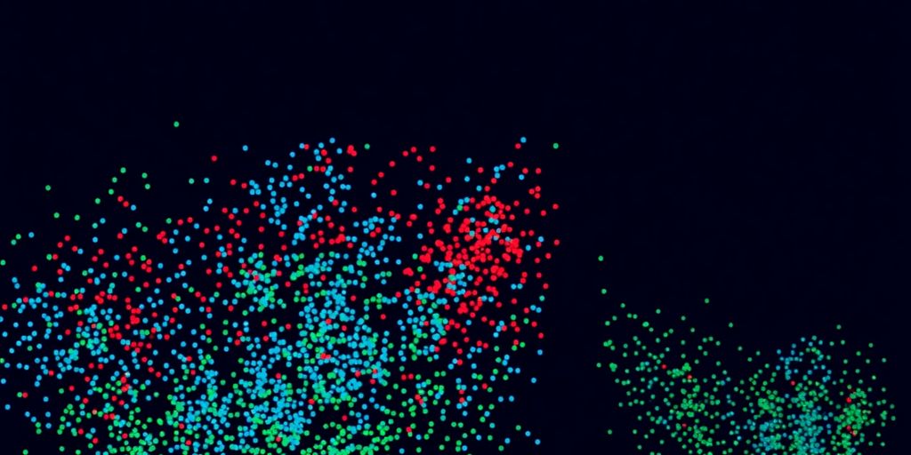
First things first, we need to draw points on a graph. A scatter plot is perfect for this. You’ll use plt.scatter(), and it takes your x and y coordinates. Think of it like putting dots on a piece of graph paper. We’ll be using our clustered data, so each point will have a position and a cluster assignment.
Mapping Data Points to Clusters
This is where the magic happens. We want each cluster to look different. The easiest way to do this is by assigning a unique color to each cluster. If you have, say, three clusters, you’ll want three distinct colors. Matplotlib can handle this automatically if you pass a list of colors corresponding to your data points, or you can loop through your clusters and plot them one by one with different colors. It’s like giving each group its own identity on the graph. You can find some great tips on preparing your data for visualization over at DataPrepWithPandas.com.
Adding Labels and Titles for Clarity
A plot without labels is like a book without words – confusing! We need to tell people what they’re looking at. Add an x-axis label, a y-axis label, and most importantly, a title for the whole plot. This makes it super easy for anyone to understand what your visualization represents. A clear title and axis labels are key to making your cluster visualization understandable at a glance.
Remember, the goal is to make your clusters visually distinct. If all the points look the same, the clustering isn’t really showing up. Experiment with different ways to represent those groups until they pop!
Enhancing Cluster Visualizations
Let’s take our cluster plots from good to great! We’ve got the basics down, but Matplotlib lets us tweak things so much more. It’s all about making those patterns pop and your clusters easy to tell apart.
Customizing Marker Styles and Colors
So, you’ve got your scatter plot, but maybe all the points look the same. That’s where changing the markers and colors comes in handy. Instead of just dots, you can use different shapes like triangles, squares, or even stars. And colors? You’re not limited to blue and orange! Picking distinct colors for each cluster makes a huge difference in readability. Think about using a different marker shape for each cluster, combined with a unique color, to make them instantly recognizable.
Here’s a quick rundown of how you might do it:
- Markers: Use the
markerargument inplt.scatter(). Try'o'for circles,'s'for squares,'^'for triangles, or'*'for stars. - Colors: Use the
cargument. You can pass a list of color names (like'red','blue') or hex codes. - Combining: You can even pass lists to both
markerandcto control each point individually, though usually, you’ll want to apply the same style to all points within a cluster.
Adjusting Point Transparency
Sometimes, you have a lot of data points, and they start to overlap, making it hard to see where clusters are dense. This is where transparency, or alpha, is your best friend. By making the points slightly see-through, you can reveal the density of points in different areas. Where points overlap heavily, the color will appear darker, giving you a visual cue about the concentration of data.
Making points semi-transparent helps a lot when you have many data points that are close together. It lets you see the areas where the points are most crowded, which is often a good indicator of where the center of a cluster might be.
Highlighting Cluster Centroids
If your clustering algorithm provides centroid information (like K-Means does), showing these points can really help. Centroids are like the ‘average’ point for each cluster. Plotting them with a distinct marker and color, perhaps a larger size or a different shape, makes it super clear where the heart of each cluster lies. This can be especially useful when you’re trying to understand the separation between clusters. You can find examples of how to visualize these boundaries in scikit-learn’s documentation.
Remember, the goal is clarity. Play around with these options until your clusters are easy to see and understand at a glance!
Exploring Different Cluster Visualization Styles
Now that we’ve got the basics down, let’s talk about making our cluster plots really pop! Sometimes, the default settings just don’t cut it, and we need to get a bit more creative to see the patterns clearly. We’ll explore how different visual choices can totally change how we perceive our clustered data.
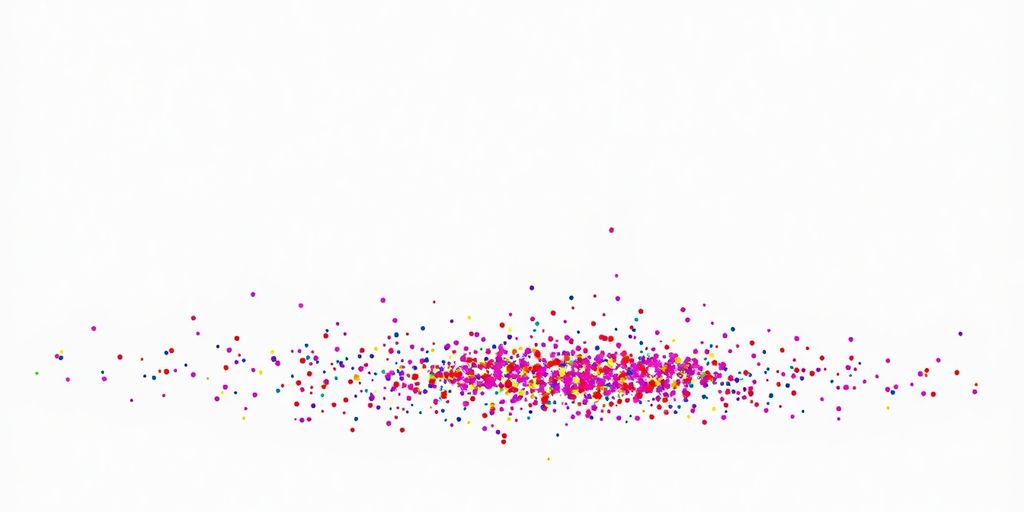
Using Different Color Palettes
Colors are super important, right? They can guide the eye and make distinctions obvious. Matplotlib has a bunch of built-in color maps, and picking the right one can make a big difference. For instance, if you have a lot of clusters, a sequential color map might not be the best choice because it implies an order that might not exist. Instead, a qualitative color map, designed for distinct categories, is usually better.
- Qualitative colormaps: Great for showing distinct groups without implying any order. Think ‘tab10’, ‘Set1’, or ‘Paired’.
- Sequential colormaps: Use these when there’s a natural progression, like intensity or magnitude. ‘viridis’ or ‘plasma’ are good examples.
- Diverging colormaps: Best for data where there’s a central point and values diverge from it, like temperature anomalies. ‘coolwarm’ or ‘RdBu’ work well here.
Choosing a palette that has good contrast between colors is key, especially if you’re printing in black and white or if some viewers have color vision deficiencies. We want everyone to see those clusters!
Incorporating Size Variations
Besides color, the size of your data points can also tell a story. Maybe you want to represent a third dimension of your data, or perhaps you want to make cluster centroids stand out more. Adjusting marker size can add another layer of information to your visualization.
- Uniform size: Simple and clean, good for basic cluster representation.
- Variable size: Map a data feature (like frequency or magnitude) to marker size. Larger markers can draw attention.
- Centroid emphasis: Make the points representing cluster centers noticeably larger than the other points.
It’s a balancing act; too much variation in size can make the plot look cluttered and hard to read. Start with subtle differences and see how it looks.
Creating Subplots for Comparison
Sometimes, you want to compare different clustering results side-by-side, or maybe visualize the same data with different visualization styles. Subplots are perfect for this! They let you arrange multiple plots within a single figure, making direct comparisons easy.
- Set up the figure and axes: Decide how many plots you need and how you want them arranged (e.g., a 2×2 grid).
- Plot each dataset/style: Call your plotting functions for each subplot, specifying which axes object to use.
- Add shared labels or titles: Make sure it’s clear what each subplot represents.
Using subplots is a really effective way to show how changing parameters or using different algorithms affects your clustering. It helps you see the nuances and make better decisions about which clustering is most meaningful for your specific problem. It’s like having multiple perspectives on the same data all at once!
Advanced Techniques for Visualizing Clusters with Python’s Matplotlib
Alright, let’s move beyond the basics and get into some really cool stuff for visualizing your clusters. We’ve covered the foundational scatter plots, but Matplotlib can do so much more to make your cluster insights pop. Ready to add some interactivity and maybe even tackle those tricky high-dimensional datasets?
Adding Interactive Elements
Static plots are great, but sometimes you want to poke around your data, right? Matplotlib, especially when paired with backends like ipympl or used within environments like Jupyter notebooks, lets you create plots that you can zoom, pan, and even hover over to see data point details. This makes exploring clusters feel much more dynamic. Imagine clicking on a cluster and having it highlight or even filter the data shown. It’s a game-changer for really getting a feel for your groupings.
Overlaying Cluster Boundaries
Sometimes, just seeing the points isn’t enough. You might want to visualize the decision boundaries that separate your clusters, especially if you’re using algorithms like K-Means or Support Vector Machines. While Matplotlib doesn’t have a built-in function for this, you can definitely draw them yourself. This usually involves creating a grid of points, predicting the cluster for each point, and then plotting contours or filled regions. It gives a clear visual representation of how your algorithm is partitioning the data space. It’s a bit more involved, but the payoff in clarity is huge.
Visualizing High-Dimensional Data
Okay, so what happens when your data has more than three features? You can’t just plot everything on a 2D graph. This is where techniques like Principal Component Analysis (PCA) or t-SNE come in handy. You can reduce your data down to two or three principal components and then plot those. This lets you see if clusters identified in the higher-dimensional space still hold up in a reduced view. It’s a way to get a glimpse of complex relationships without getting lost. Remember, Matplotlib is a versatile tool for all sorts of data visualizations, including these more complex scenarios. You can explore more about Matplotlib’s capabilities to see how it can help.
Making your cluster visualizations interactive or showing boundaries can really help others understand your findings. Don’t be afraid to experiment with these advanced methods to bring your data stories to life.
Making Your Cluster Visualizations Shine
Alright, you’ve put in the work and created some fantastic cluster visualizations! Now, let’s talk about making them truly shine and get your findings noticed. It’s all about presentation and making sure your hard work is easily understood.
Exporting High-Quality Plots
When you’re ready to share your work, you’ll want to save your plots in a format that looks great everywhere. Matplotlib makes this super easy. You can save your figures in various formats like PNG, JPG, SVG, and PDF. For most web use or presentations, PNG is a solid choice. If you need a scalable vector graphic that won’t lose quality when you zoom in or resize it, SVG is your best friend. PDFs are also great for documents.
Here’s a quick rundown on saving:
- Find the
savefig()function: This is your go-to for saving plots. - Choose your filename and format: Just type
plt.savefig('my_clusters.png')orplt.savefig('my_clusters.svg'). - Consider resolution (DPI): For higher quality images, especially for print, you can specify the dots per inch (DPI) like
plt.savefig('my_clusters_high_res.png', dpi=300).
Don’t forget to save before you show the plot if you’re using interactive backends, or make sure you’re saving the correct figure object!
Best Practices for Presenting Your Findings
How you present your visualizations can make a big difference in how well your message comes across. Think about your audience and what they need to see.
- Keep it clean: Avoid clutter. Too many labels or unnecessary elements can distract from the main message.
- Use clear labels: Make sure your axes are labeled, and if you’re using different colors or markers for clusters, include a legend.
- Tell a story: Your visualization should support the narrative of your analysis. What do the clusters mean?
- Context is key: Briefly explain what the plot shows and what insights can be drawn from it.
When you’re showing off your cluster visualizations, remember that clarity trumps complexity. Your goal is to communicate insights effectively, not to show off how many features you can cram into a plot. A well-labeled, focused visualization will always be more impactful than a busy, confusing one.
Troubleshooting Common Visualization Issues
Sometimes, things don’t look quite right, and that’s totally normal! Here are a few common hiccups and how to fix them:
- Overlapping points: If your points are all bunched up, try adjusting the alpha (transparency) value. A little transparency can reveal density.
- Colors not distinct: If your cluster colors are too similar, try a different colormap or manually assign distinct colors to each cluster.
- Labels are unreadable: If your labels are overlapping or too small, you might need to adjust the font size or position them manually. Sometimes, rotating labels can help too.
Don’t get discouraged if your first few attempts aren’t perfect. Experimenting with different settings is part of the process, and you’ll get the hang of it!
Keep On Plotting!
So there you have it! We’ve gone through how to make your cluster data pop using Matplotlib. It’s not too tricky once you get the hang of it, right? You can really see patterns and differences when you put them into a graph. Don’t be afraid to play around with different colors and markers to make your plots even clearer. The more you practice, the better you’ll get at showing off your data’s story. Happy plotting!
Frequently Asked Questions
How do I get my computer ready to make cluster pictures?
You’ll need Python installed on your computer. Then, you can use a tool like pip to install Matplotlib and other helpful libraries such as NumPy and Scikit-learn, which are great for working with data.
What computer programs do I need to use?
Matplotlib is the main tool for drawing. You’ll also want NumPy for number crunching and Scikit-learn to help sort your data into groups (clusters).
What should I know about my data before I start drawing?
Before you draw, look at your data. See what kind of numbers you have. Are they big or small? Do they have decimals? Knowing this helps you pick the best way to show them.
What’s a scatter plot and how does it show clusters?
A scatter plot is like a dot-to-dot picture. Each dot is a piece of your data. You can color-code the dots based on which cluster they belong to, making it easy to see the groups.
How can I make my cluster pictures look cooler?
You can change the dots! Make them different shapes, use bright colors, or make them a bit see-through so you can see overlapping dots. You can also mark the very center of each cluster.
Can I save the pictures I make?
Yes, you can save your pictures as image files like PNG or JPG. Make sure to save them in a good size and quality so they look sharp when you share them.