When you’re working with data in Python, making sense of it often means creating a good plot. There are tons of tools out there, but some python library plot options are just better than others for getting your message across clearly. This article looks at some of the top choices for making your data visualizations stand out.
Key Takeaways
- Matplotlib is a basic but very flexible python library plot tool.
- Seaborn builds on Matplotlib, making complex statistical plots easier.
- Plotly creates interactive, web-based plots.
- Bokeh also focuses on interactive plots for the web.
- Altair uses a declarative approach for building plots.
1. Matplotlib
Alright, let’s kick things off with the granddaddy of Python plotting libraries: Matplotlib. If you’ve done any data visualization in Python, chances are you’ve bumped into this one. It’s been around for ages and for good reason. Matplotlib gives you a ton of control over pretty much every element of your plot. Think of it as the foundational toolkit that many other libraries build upon.
It’s incredibly versatile, letting you create everything from simple line charts to complex scientific visualizations. You can tweak colors, line styles, text labels, axis limits – you name it. It’s not always the flashiest out of the box, but its power lies in its customizability. You can really make your plots say exactly what you want them to.
Here’s a quick rundown of why it’s so popular:
- Extensive Customization: Seriously, you can change almost anything.
- Wide Range of Plot Types: Line plots, scatter plots, bar charts, histograms, pie charts, and so much more.
- Publication-Ready Output: With a bit of effort, you can generate plots that look professional and are ready for reports or papers.
- Integration: Plays nicely with NumPy and Pandas, which are staples in the data science world.
Getting started is pretty straightforward. You usually import it as plt and then start calling functions like plt.plot() or plt.scatter().
Matplotlib’s strength is its granular control. While some newer libraries offer quicker ways to make aesthetically pleasing plots, Matplotlib lets you get into the nitty-gritty details. This makes it perfect for those times when a standard plot just won’t cut it and you need something specific.
2. Seaborn
Seaborn is another fantastic library that builds on top of Matplotlib, making it super easy to create attractive and informative statistical graphics. If you’ve ever found Matplotlib a bit too hands-on for complex plots, Seaborn is probably going to feel like a breath of fresh air. It’s got this really nice default aesthetic that just looks good right out of the box, and it handles things like color palettes and plot styles with a lot of grace.
It’s especially great for visualizing relationships within your data. Think about exploring how different variables interact or how data is distributed across categories. Seaborn makes these kinds of explorations much more straightforward. You can whip up things like heatmaps, pair plots, and violin plots with just a few lines of code. It’s like having a helpful assistant who knows exactly how to present your data beautifully.
Here are a few things Seaborn really shines at:
- Distribution plots: Easily see how your data is spread out, whether it’s a single variable or how two variables relate.
- Categorical plots: Perfect for comparing data across different groups or categories.
- Regression plots: Visualize the relationship between two variables and fit a regression model.
Seaborn really simplifies the process of creating visually appealing and insightful statistical plots. It’s built for making complex visualizations accessible, so you can spend less time fiddling with plot details and more time understanding what your data is telling you. It’s a go-to for anyone wanting to add a bit more polish and statistical depth to their data stories. You can even get started with data preparation using resources like DataPrepWithPandas.com to make sure your data is ready for Seaborn’s magic.
Seriously, if you’re looking to make your data plots pop and tell a clearer story, give Seaborn a try. It’s a real game-changer for statistical visualization.
3. Plotly

Alright, let’s talk about Plotly. If you’re looking to create some seriously interactive and good-looking plots, Plotly is your go-to. It’s built for the web, meaning your visualizations can be shared and explored easily online. Plotly lets you build beautiful, interactive charts that go way beyond static images.
What makes Plotly stand out? Well, for starters, it’s incredibly versatile. You can make everything from simple scatter plots to complex 3D graphs and even dashboards. It’s also got a great way of handling different types of data, making it a favorite for many data scientists.
Here are a few things you can do with Plotly:
- Create interactive charts like line graphs, bar charts, and heatmaps.
- Build 3D plots, contour plots, and even animations.
- Integrate with web frameworks like Dash for building full-blown analytical applications.
- Export your plots in various formats, including HTML, PNG, and SVG.
It’s pretty neat how you can zoom, pan, and hover over data points to get more information without needing any extra code. This interactivity really helps in exploring your data.
Plotly’s strength lies in its ability to make data visualization accessible and engaging. Whether you’re presenting findings to a team or just exploring a dataset yourself, the interactive nature of Plotly charts makes the process much more dynamic and insightful. It’s a fantastic tool for anyone wanting to add a bit of sparkle to their data stories.
4. Bokeh
Alright, let’s talk about Bokeh. If you’re looking to make your data plots pop with interactivity, Bokeh is a fantastic choice. It’s built to create beautiful, interactive visualizations that you can actually use on websites or in dashboards. Think of it as a way to bring your static charts to life.
What makes Bokeh so cool? Well, it uses HTML and JavaScript under the hood, which means your plots are web-native. You don’t need any special plugins for people to see them, just a web browser. This makes sharing your insights super easy.
Here’s a little of what you can do with Bokeh:
- Create interactive charts like scatter plots, line graphs, and bar charts.
- Add tooltips that show more information when you hover over data points.
- Link multiple plots together so zooming or panning in one affects the others.
- Build custom dashboards and applications with its server component.
Bokeh really shines when you need more than just a static image. It’s great for exploring datasets where you want to zoom in, pan around, and see details without reloading anything. It’s a really neat way to present your findings, and you can get started with some basic plots pretty quickly. If you’re interested in getting your hands dirty with interactive plots, checking out the Bokeh data visualization library is a good next step. It’s a library that’s definitely worth exploring if you want your data stories to be more engaging.
5. Altair
Altair is a really neat Python library for making statistical charts. It’s built on Vega-Lite, which is a declarative language. What does that mean for us? Well, instead of writing tons of code to tell the computer exactly how to draw every single line and point, you just describe the plot you want. You say, ‘I want a scatter plot with these columns for the x and y axes, and color this group differently.’ Then, Altair figures out the rest! It’s pretty cool because it makes creating complex plots surprisingly straightforward.
This declarative approach really speeds things up. You can go from raw data to a beautiful visualization in just a few lines of code. It’s fantastic for exploring data because you can quickly try out different visual encodings – like changing a bar chart to a scatter plot or mapping a different variable to color – without a huge amount of rework.
Here’s a little taste of what makes Altair so good:
- Simplicity: You focus on the what, not the how. This means less time wrestling with syntax and more time understanding your data.
- Interactivity: Altair plots can be interactive right out of the box. Think zooming, panning, and tooltips that show data details when you hover over points. It makes exploring data much more engaging.
- Consistency: Because you’re describing the plot, Altair ensures a consistent look and feel across all your visualizations. No more fiddling with individual plot elements to make them match.
If you’re looking to build interactive charts that are easy to share and understand, Altair is definitely worth checking out. It’s a great way to make your data stories pop without getting bogged down in the technical details of plotting. You can get started with the basics of Altair’s syntax and see how quickly you can create compelling visuals.
6. ggplot
Alright, let’s talk about ggplot! If you’ve ever dabbled in R, you’ve probably heard of ggplot2. Well, the Python version aims to bring that same awesome grammar of graphics to your Python projects. It’s all about building plots layer by layer, which sounds fancy, but it actually makes things pretty intuitive once you get the hang of it.
The core idea is to separate the data from the aesthetics and the geometric objects. This means you can easily swap out data or change how it looks without rewriting tons of code. It’s a really neat way to think about making visualizations.
Here’s a simplified look at how you might use it:
- Define your data: Start with your Pandas DataFrame.
- Map aesthetics: Tell ggplot which columns map to which visual properties (like x-axis, y-axis, color, size).
- Add geometric objects: Choose the type of plot you want – points, lines, bars, etc.
- Apply scales and themes: Tweak colors, labels, and the overall look.
It’s a fantastic tool for creating complex, publication-ready plots with a consistent style. If you’re looking to get your data ready for analysis, checking out resources on data preparation with Pandas can be a great first step, and ggplot fits right into that workflow. You can really make your data tell a story with this library.
Building plots with ggplot feels less like coding and more like assembling a visual puzzle. You specify what data goes where, and the library handles the heavy lifting of rendering it beautifully. It’s a system that rewards understanding its components, and the results are usually worth the effort.
7. Folium
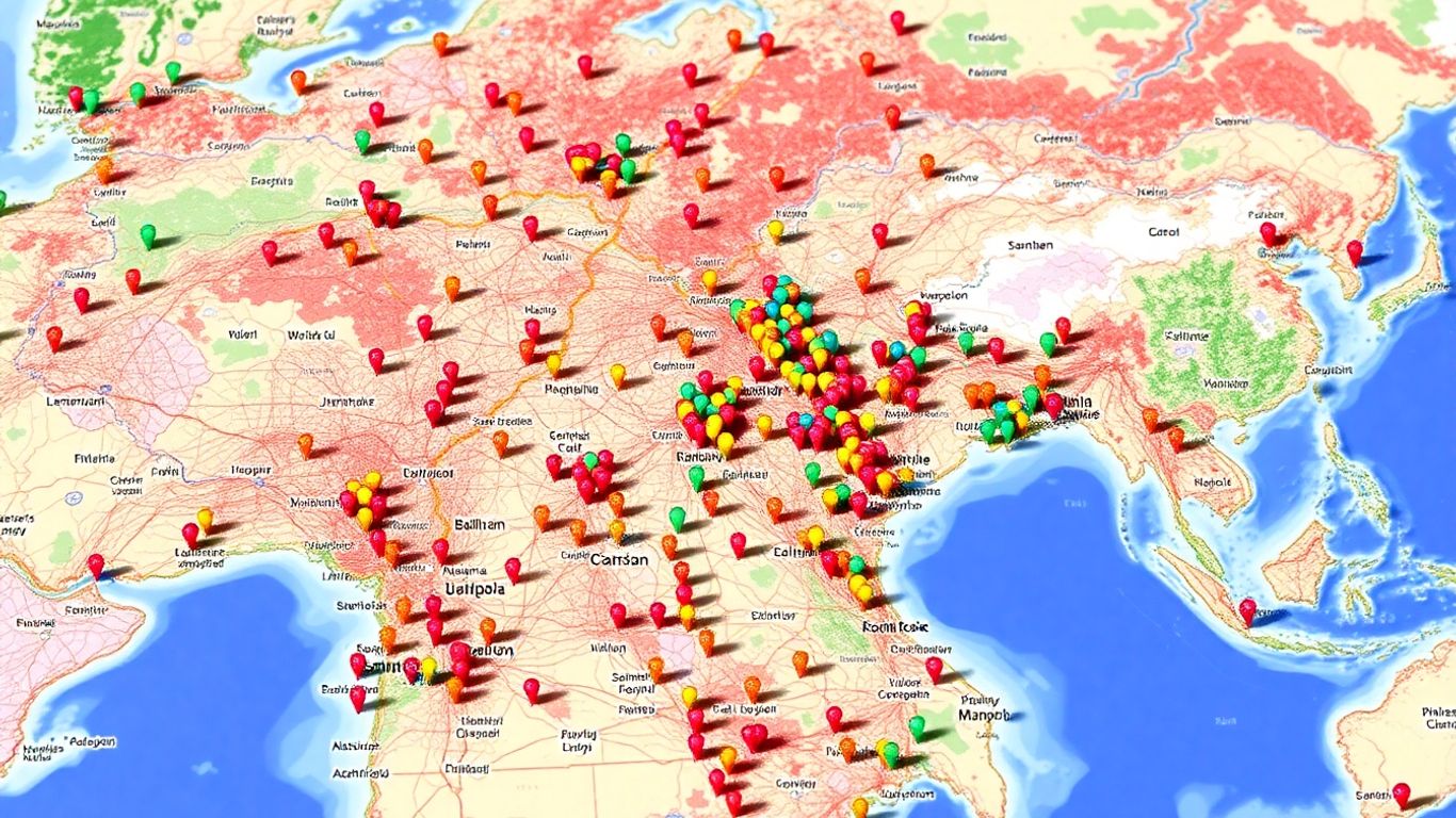
Alright, let’s talk about Folium! If you’re looking to make your data pop on a map, this is your go-to library. It’s built on top of Leaflet.js, which is a super popular JavaScript library for interactive maps. What’s cool about Folium is how it bridges the gap between Python’s data handling capabilities and the interactive mapping power of Leaflet. You can easily create all sorts of maps, from simple markers to complex choropleth maps showing data distributions.
Folium makes creating interactive maps a breeze, even if you’re not a web developer. It’s fantastic for visualizing geographical data, and you can customize almost everything. Think about showing population density, sales figures by region, or even tracking the path of a storm. It’s all possible with Folium.
Here’s a quick rundown of what makes it so great:
- Interactive Elements: Add tooltips, popups, and even custom controls to your maps.
- Layer Control: Easily switch between different map layers, like satellite views or street maps.
- Data Visualization: Visualize data directly on the map using markers, circles, and polygons.
Getting started is pretty straightforward. You usually start by creating a map object, then you add your data to it. For instance, if you have geographical coordinates, you can plot them as markers. If you have data associated with specific regions, you can use choropleth maps to color those regions based on your data values. It’s a really neat way to see patterns that might not be obvious in a table. You can find some great examples and tutorials to help you get started with data analysis using Python.
Folium is all about making maps that people can actually interact with. You’re not just looking at a static image; you’re exploring data on a living map. This interactivity is key for understanding spatial relationships and trends in your datasets. It’s a really fun way to present geographical information.
8. Geoplot
Alright, let’s talk about Geoplot! If you’re looking to make some really cool maps with your data, this is a library you’ll want to check out. It’s built on top of Matplotlib, which is great because you get all the power of Matplotlib but with a special focus on geographic data. Geoplot makes creating beautiful and informative maps surprisingly straightforward.
What’s neat is how it simplifies common mapping tasks. Instead of wrestling with complex projections and coordinate systems yourself, Geoplot handles a lot of that heavy lifting. You can easily create different types of maps, like choropleths (where areas are colored based on data values) or scatter plots on maps.
Here are a few things that make Geoplot stand out:
- Easy Choropleths: Quickly color regions on a map based on your data. Think showing population density by state or sales figures by country.
- Projection Support: It’s got built-in support for various map projections, so you can choose the best way to represent your geographic area.
- Customization: While it simplifies things, you still have plenty of control to tweak the look and feel of your maps.
It’s especially handy when you’re working with shapefiles or other geographic boundary data. You can load these in and then overlay your own data points or summaries.
Geoplot really shines when you want to visualize spatial patterns. It takes the complexity out of map-making, letting you focus on what your data is telling you about the world.
So, if you’ve got data that has a location component, give Geoplot a spin. It’s a fantastic tool for bringing your geographic insights to life!
9. Yellowbrick
Alright, let’s talk about Yellowbrick. If you’re knee-deep in machine learning and want to see what’s really going on under the hood, this library is a pretty neat tool. It’s built on top of Matplotlib, so it plays nicely with other plotting libraries, but its main gig is helping you visualize your machine learning models. Think of it as a visual debugger for your ML projects.
Yellowbrick gives you a bunch of visualizers that help you understand your model’s performance at different stages. You can check out things like:
- Residual plots to see how well your regression model fits the data.
- Classification reports to get a clear picture of your model’s accuracy, precision, and recall.
- Feature importances to understand which input features are most influential.
It’s super helpful for diagnosing problems and getting a feel for how your model is learning. Instead of just looking at numbers, you get actual plots that make things much clearer. It’s a great way to get a handle on data preparation, too, as you can see how your data transforms. You can find some really practical advice on getting started with data preparation at DataPrepWithPandas.com.
Yellowbrick really shines when you’re trying to tune hyperparameters or compare different models. Seeing the results visually can save you a ton of time compared to just sifting through metrics. It makes the whole process feel a lot more intuitive, which is always a win in my book.
10. NetworkX
So, you’ve got some data that looks like a web of connections? Maybe it’s social networks, road systems, or even how different proteins interact. That’s where NetworkX comes in, and it’s pretty neat for handling this kind of stuff. It lets you build and play with graphs, which are basically just collections of points (nodes) and lines connecting them (edges).
NetworkX is your go-to for creating, manipulating, and studying the structure, dynamics, and functions of complex networks. It’s not strictly a plotting library like Matplotlib or Seaborn, but it plays really well with them. You can build your network structure using NetworkX, and then hand it off to a plotting tool to actually see what it looks like. It’s a fantastic way to get a handle on relationships within your data.
Here’s a quick rundown of what you can do:
- Create graphs: You can start from scratch, adding nodes and edges one by one, or even load them from existing data files.
- Analyze networks: NetworkX has built-in tools for things like finding shortest paths, identifying central nodes, or detecting communities within your network.
- Visualize networks: While NetworkX doesn’t draw the plots itself, it provides the structure that libraries like Matplotlib can use to draw your graph. You can see your network structure visually in no time.
Building a graph can feel a bit like drawing a map. You decide where the cities are (nodes) and what roads connect them (edges). Once you have that basic layout, you can start asking interesting questions about how to get from one place to another or which cities are most important for connecting the rest of the map. It’s a powerful way to understand interconnected systems.
It’s a really useful tool if your data has a lot of interdependencies. Give it a shot when you’re dealing with connected data; you might be surprised at how much insight you can gain!
Wrapping Up Your Plotting Journey
So, there you have it! We’ve looked at some really cool Python tools that can make your data look amazing. Whether you’re just starting out or you’ve been plotting for a while, there’s something here for everyone. These libraries make it pretty straightforward to turn numbers into pictures that tell a story. Don’t be afraid to try them out and see what works best for you. Happy plotting!
Frequently Asked Questions
What’s the main point of using these Python plotting tools?
These tools help you make cool pictures, like charts and graphs, from your data. It’s like drawing a story with numbers so people can understand it easily.
Which tool is best for beginners?
Matplotlib is often a good starting point. It’s like the basic building blocks for making plots, and once you get the hang of it, you can move to other, fancier tools.
Can I make interactive plots that people can click on?
Yes, definitely! Libraries like Plotly and Bokeh are awesome for making plots that move and change when you interact with them. They’re great for websites.
What if I want to draw maps with my data?
For maps, Folium and Geoplot are your go-to libraries. They let you put your data points right onto maps, showing where things are happening.
Are there tools for showing how things are connected, like social networks?
Absolutely! NetworkX is perfect for this. It helps you visualize how different things or people are linked together, making complex connections easier to see.
Do I need to be a math whiz to use these?
Not at all! While understanding data is helpful, these libraries are designed to make plotting easier. They handle a lot of the tricky math behind the scenes, so you can focus on making clear visuals.